Sunday, December 11, 2011

It takes a keen eye

So... I flipped the page in my album to see what the next set of post cards will be; surprise! we're still in the Royal Gorge. These two cards are a close-up of the Hanging Bridge - about which I know I have posted in the past (see earlier today).
These two pictures are much clearer than any others I have. As I examine them closer I see that this is because they were printed in 1938. These two cards are from the Linen Card Era. The number in the bottom right hand corner (8A-H192) tells me right away that these cards were printed by Curt Otto Teich's company. The 8A indicates that it was printed in the 1930s (the A tells us that) and specifically in 1938 (th 8 tells us that). The H after the dash indicates that the cards are of the Colortone type that Curt Teich produced. The 192 is an internal information number.
I kept both of them not because one of them is more yellow than the other (although that could be an indicator of a different print run - not just poor storage) but because they are actually from different print runs. Everything on the front is exactly the same (except the yellow hue); but, when you turn them over there is a very clear indicator that they are not from the same print run.
As we turn over the card, they do both look exactly the same. The descriptive words that tell you what is on the front of the cards are the same; the publisher on the left-hand side of the card is the same; the printer the "line" down the middle of the card is the same printer. But, upon closer inspection we see that the words POST CARD are in a different location and in a different font. I believe that the bottom card is older than the top one. When the US Postal Service finally allowed us to send post cards in the mail, the back side was for the address only. Then on March 1, 1907 we were able to put the address and a short message on the same side of the card. The address had to be on the right-hand side of the card and the message on the left. Many, I dare say most, of the post cards of this era remind you of which side which part is allowed. "THIS SIDE FOR ADDRESS ONLY" and "THIS SIDE FOR MESSAGE" are very prominent on the cards in my collection. It looks like this card has a bit of a carry-over from that era.

The other indicator that these are two print runs is that the name of the publisher, Curt Otto Teich and his patented printing process ("C.T. Art-Colortone")are each printed in the opposite direction on the two cards.

Who is the publisher? you ask. The Deseret Book Company is the official printer and distributor of the Mormon Church print material. The Deseret Book Company is the result of a merger between the Deseret News Bookstore and the Deseret Sunday School Union Bookstore in 1919 and formally adopted its name in 1920. They can both trace their organizational roots to George Q. Cannon, a Latter-day Saint General Authority. The bookstore is named after "deseret," a word from the Book of Mormon meaning "honeybee".

Triplets

At one point, in the Royal Gorge, the river and the two canyon walls are so close together that there was no easy way to lay the tracks for the train to pass through. A genious engineer (civil, not train) thought of laying a bridge that was suspended over the water rather than held up by piers. They inserted girders into the canyon walls and suspended the bridge for the train to get through the canyon.
These three post cards show the bridge from the same angle.
The top card and the card on the right (with the steam engines obviously drawn in)are from the same printer. They are both embossed. You can feel where the girders are in the picture as well as some of the mountains. When you turn them over the writing surface is not even. The words Post Card are both over an Amercian flag on a staff laid on its side.

The card on the left looks suspiciously similar to the card on the right. The big difference is that the picture is much more fuzzy. The blotches on the canyon wall to our right are in the exact same locations. And, it looks like a second steam engine is right behind the one on the bridge. When I turn it over I see that it is printed by a different company. The Post Card words are surrounded by an ornate swirl.

I love the creativity of the printers and publishers of this eara. One of the cards was mailed on June 9, 1908 at 2:30 PM. I guess everyone was making enough profit from selling these cards that they didn't have to worry about copyright infringement, etc.

This type of duplication is very common and I see many times over in my collection of train postcards. I know it happened in other types of cards, too.

Wednesday, November 16, 2011

Relatives?

I was looking at the backs of the post cards recently and discovered an interesting puzzle. Many, many years ago, Kodak sold a camera with which a person could take a picture and open a part of the back of the camera and inscribe on the photo. When the picture was printed the inscription was included on the photo. It looked something like this postcard....

As I turned it over to see that it was actually a Kodak postcard, I saw the Kodak logo in the top right where the stamp should go. I also noticed that the photographer had taken the time to have a rubber stamp made and had stamped his name and address on the dividing line. It is very hard to read after being scanned so I won't include a picture here. but the information says it was taken by L. Fremming 1650 North Pacific Kelso, Wn. I typed the address into Google and found that there is an address that corresponds to this in Kelso, Washington.

Then I turned this post card over.

In the same position - the dividing line between the address and the message - sits the printed name of Bob Fremming. Bob is from Dallas, Wisconsin. It got me to wondering if these two train post card buffs are related. There are enough years between the publication years that the family might have move to Wisconsin where Bob was able to expand his family interest in trains to publishing his own postcars professionally.

Thursday, April 28, 2011

Twins?

There are many postcards that look like each other. You met two of them a couple of posts ago. Here are two more. Comparing the fronts of these two cards, we could easily come to the conclusion that they are the same picture. Because one is darker than the other, we might think that the only difference is that they were printed earlier and later in the same print run. That is almost the correct story.
These are the same picture.

They are pictures of the Hanging Bridge in the Royal Gorge, in the Grand Canyon of the Arkansas River in Colorado. The descriptions on the backs of the cards have the exact same wording. They were even both printed by the same company; that is what the little critter on the top, middle of the card indicates. “He” is the logo of the H. H. Tammen Curio Company of Denver, Colorado. It existed from 1896 to 1953 at its last known address: 1516 Arapahoe Street, Denver, CO.
But, at first glance, it looks as if the same picture was printed by two different companies. It could make us wonder about copyright infringement. However, if you look in the left margin of the cards you will see that they were published by two companies with very similar names: The Van Noy-Interstate Co. and The Interstate Co. This led me to want to delve deeper into the mystery of the publishing companies. Here is what I have found.


Van Noy Railway Hotel and News began a series of mergers and acquisitions in 1914, starting with the Brown News Company (also headquartered in Kansas City) which was acquired on October 1, 1914 began operating as Van Noy News. In 1915, the Company began consolidating operations with the New York City based Interstate News Company. The company name was then changed to The Van Noy Interstate News Company in 1917, but the company headquarters remained in Kansas City under the leadership of Ira C. Van Noy. As a result of changes in railroad passenger train service, Van Noy Interstate began to focus more on the hotel side of their operations. In 1922, the Company acquired the Gem Fountain Company, and in 1926 the company began operating as the Interstate Company.
Both cards belong to the “White Border Era”, which lasted from about 1915 to 1930. The card printed by The Van Noy-Interstate Company was published first – sometime between 1917 and 1926. The card published by The Interstate Company was printed between 1926 and 1930.

Saturday, April 9, 2011

Let's Visit California

I lived in California for several years, many in southern California. These trees in the picture look like the trees in and around the Joshua Tree National Park. The National Park was created in 1936; the picture on this postcard is from at least 35 years prior to that. Notice that it takes two steam engines to pull only 6 cars. If I remember right (the last time I was there was probably in 1976 or 77) the park is in California's high desert area north of Palm Spring and Indio.

The copyright on the front is from 1901 by the Detroit Photographic Company.

This company was started in the 1890s in Pearl River, New York. It changed its name to Detroit Publishing in 1905. That would mean that this postcard was printed sometime between 1901 - the date of the copyright and 1905 - the date when the company changed its name.
Another clue to the date of the postcard can be found the on the reverse side. There is no room for a message from the sender on the back. I have seen messages scrawled around the pictures on the front of the card, but, no writing was allowed on the back side except the address.

That means that this card was printed sometime before March 1, 1907. That was the date when the United States Post Office grudgingly allowed the address to share space with a short message on the back of a picture postcard.
They very quickly learned what a great decision that was and probably kicked themselves for not going forward much sooner. Many companies started using the picture post cards for advertising and millions of tourists sent them to their friends and families to show where they had been.

Monday, April 4, 2011

Copyright Infringement?

Comparing the fronts of these two cards, we could easily come to the conclusion that they are the same picture. Because one is darker than the other, we might think that the only difference is that they were printed earlier and later in the same print run. That is almost the correct story.
These are the same picture.

They are pictures of the Hanging Bridge in the Royal Gorge, in the Grand Canyon of the Arkansas River in Colorado. The descriptions on the backs of the cards have the exact same wording. They were even both printed by the same company; that is what the little critter on the top, middle of the card indicates. “He” is the logo of the H. H. Tammen Curio Company of Denver, Colorado. It existed from 1896 to 1953 at its last known address: 1516 Arapahoe Street, Denver, CO.
But, at first glance, it looks as if the same picture was printed by two different companies. It could make us wonder about copyright infringement. However, if you look in the left margin of the cards you will see that they were published by two companies with very similar names: The Van Noy-Interstate Co. and The Interstate Co. This led me to want to delve deeper into the mystery of the publishing companies. Here is what I have found.

Van Noy Railway Hotel and News began a series of mergers and acquisitions in 1914, starting with the Brown News Company (also headquartered in Kansas City) which was acquired on October 1, 1914 began operating as Van Noy News. In 1915, the Company began consolidating operations with the New York City based Interstate News Company. The company name was then changed to The Van Noy Interstate News Company in 1917, but the company headquarters remained in Kansas City under the leadership of Ira C. Van Noy. As a result of changes in railroad passenger train service, Van Noy Interstate began to focus more on the hotel side of their operations. In 1922, the Company acquired the Gem Fountain Company, and in 1926 the company began operating as the Interstate Company.
Both cards belong to the “White Border Era”, which lasted from about 1915 to 1930. The card printed by The Van Noy-Interstate Company was published first – sometime between 1917 and 1926. The card published by The Interstate Company was printed between 1926 and 1930.

Thursday, March 31, 2011

Two Cards that Look the Same

This is one of the aspects that I like about collecting the postcards. These two cards look like the same postcard, but they are different – sort of. They are the same view into the Royal Gorge and the Hanging Bridge.

But, the postcards have a couple of differences worthy of pointing out.
These cards were both published by the E. C. Kropp Company of Milwaukee. The publisher’s name is on both cards. On the card to the left you will find the name and a card number at the very bottom, slightly cut off in the printing. One the card to the right, the publisher has moved that information to the left margin.
This company has existed, in several forms, for a very long time. It began producing postcards as Kropp in 1898. In 1907, it changed its name to E.C. Kropp Company – just in time to catch the end of the “Address Only on This Side of Card” era. (More about that later regarding these two cards) They were bought in 1956 by L. L. Cook and today are now part of GAF Corporation. It is very interesting to hold a postcard that is over 100 years old, knowing that the company that published it is still around in one form or another.
When we turn the cards over, we can see they are also slightly different on the back. They both have the EC Kropp “bird” logo with the words Post Card on it. But, the slight differences are in two places: 1) the postage stamp square – the frame and the lettering are ever so slightly different from each other; and 2) the warnings that this side is only for the address are worded differently from each other.

These cards make we wonder which one was published first. My guess is that the one on the left came first for two reasons: 1) they discovered that their name and the postcard number were cut off in the production, so they moved them; and 2) as the time for the opportunity to write the address and a message on the back came closer – but was still not legal, they had to warn the writers that the back side of the card was still EXCLUSIVELY for the address.
Even so, as close as these two cards are to each other, I count them as separate cards in my collection because of these slight differences. I don’t see them as duplicates.

Saturday, March 19, 2011

This one was used!

This card, on the back, is very similar to the last one I wrote about. It, too, belongs to the “Divided Back” group. That means that it was printed around 1907 to 1915. The picture goes right to the edges and on the back is a dividing line between the address and the message. You can see that people are getting used to the idea that they can write both the address and a message. On the left of the card, the reminder: “This space Can Be Used for a Written Message” has been shortened to “THIS SPACE FOR MESSAGE”.
However, we know more about the age of this card because it was actually used. It as mailed on October 22, 1913 from Fort Morgan, Colorado. It is on Interstate 76 northeast of Denver. A little piece of trivia regarding Fort Morgan: Glenn Miller, who was born in Iowa, went to school here. He is the big band leader who went missing toward the end of World War II. His plane disappeared over the English Channel in bad weather.
It is being mailed to Scotts Bluff, Nebraska, which is almost straight north of Fort Morgan. Scotts Bluff is on the routes of both the Oregon Trail and the Mormon Trail.
This picture is of the Gorge looking away from Denver.

There is another hint in this picture of an amazing engineering feat. You can see to lines at the bottom of the card that seem to go from one side of the canyon to the other. The train has just passed under the support beams for the Hanging Bridge.
This was printed, and it looks like it was also published, by the HH Tammen Company.
One thing I like about cards that have been used is the insight they give us to the lives of the people that wrote them. I like to think that this is Anna Ford writing to her husband, Walter.

Anna has gone out west to visit a friend or relative who just had a baby. While there, they received the news that her 4 year old nephew had an operation for an abscess and isn’t expected to live longer than a day. Then she reminds her husband to pick her up at the train station. On the top of the card she lets him know that it rained – “but not enough to keep the folks from working”.

Sunday, March 13, 2011

100 years old?

This card also belongs to the “Divided Back” group. That means that it was printed around 1907 to 1915. The picture goes right to the edges and on the back is a dividing line between the address and the message. You can see that people are getting used to the idea that they can write both the address and a message. On the left of the card, the reminder: “This space Can Be Used for a Written Message” has been shortened to “THIS SPACE FOR MESSAGE”.

We are still in Colorado and will be for a very long time. Volume One of my collection focuses exclusively on Colorado. The majority of the cards from Colorado are all about the Royal Gorge. The Royal Gorge is a good 3 hour drive east of Denver. The Arkansas River has carved it out similar to what the Colorado River has done to the Grand Canyon, but on a much smaller scale.


This picture is another picture of the Gorge looking toward Denver. There is a hint in this picture of an amazing engineering feat. You can see to lines at the bottom of the card that seem to go from one side of the canyon to the other. These are the support beams for the, as they like to advertise, “Famous Hanging Bridge”.
This was printed, and it looks like it was also published, by the HH Tammen Company. Because it is a divided back card and there is no mention of any other company and no post marking, the best I can do to guess the age of the card is to say that it was probably printed some time between 1907 and 1915. It is approximately 100 years old.

Friday, March 11, 2011

Another Divided Back. . .

This card belongs to the “Divided Back” group. That means that it was printed around 1907 to 1915. The picture goes right to the edges and on the back is a dividing line between the address and the message. Also, on the message side is the sentence, “This space Can Be Used for a Written Message.”

A printing company existed for a very short time (1905 – 1910) during these years. It was known as the Williamson-Haffner Engraving Co. of Denver, Colorado. They published souvenir books and postcards of the western states. The company was based in Denver and this picture is of the Royal Gorge – a natural match.
I had to be quite the detective to determine some information about today’s feature card. I have seen the American flag wrapped around the staff like that on many postcards. However, not very often is there any identification about the printer included. As I researched and researched the various cards, I finally found two of them holding the secret – at least I hope it is the secret to the identity of the printer. I am not 100 percent convinced. These two cards have the logo of the Williamson-Haffner Engraving Co. and the same American flag!

That would mean that this postcard was printed sometime between March 1, 1907 (when people could start writing messages on the backs of postcards) and 1910 (when the company disappeared).
The left side of the card says that it was published for Van Noy News Co. – also of Denver, Colorado. Van Noy News Co. operated under that name for a very short time. The Van Noy Railway Hotel and News began in 1914, after a series of mergers they changed their name to Van Noy News Co. on October 1, 1914. They then changed their name to Van Noy Interstate News Company in 1917. This doesn’t help the theory that this card was printed between 1907 and 1910. The Van Noy News Co. only existed between 1914 and 1917.
I wonder if someone else picked up the American flag logo after Williamson-Haffner Engraving Co. went by the wayside…

Wednesday, March 9, 2011

Back into the Royal Gorge

The previous card belongs to a group called “The Divided Back”. The pictures went right to the edge of the cards and the backs were the first backs to be divided into two parts: the right for the address and the left for a message. Sometimes there is a message on the back to remind folks that they can write on the left side of the card. This group was printed from about 1907 to 1915.

The card featured in today’s post belongs to the “White Border” group. These cards were printed from about 1915 to 1930. They were still divided on the back, but there was a noticeable change on the front. A white border appeared.
We are going back to the Royal Gorge today. This card is younger than the card in the last post. I can tell right away because it has a white border around the picture. The picture on the front of the card is of the Railroad’s East entrance – surrounded by a white border. By looking on the back of the card, I can narrow the date of printing even more.


The printer is the H. H. Tammen Curio Company. It began business in 1896 and finally wrapped up in 1953. It operated out of 1516 Arapahoe Street, in Denver, Colorado. (So it is fitting that they would promote the Royal Gorge!) You can see the little mascot in the top middle of the card and the arrow pointing up to it with H H T CO imprinted on it. These are definitive signs that point to the H.H. Tammen Curio Co.
The publisher, on the left side of the card printed sideways, is The Interstate Co., also of Denver, Colorado. The Van Noy Railway Hotel & News, which came into being in 1914, became the Van Noy News Co., after some mergers with other companies, On October 1, 1914.
In 1915, they began consolidating operations with the Interstate News Company out of New York City. The company name was changed to the Van Noy Interstate News Company in 1917, under the direction of Ira C. Van Noy. The Van Noy Interstate Company began to focus on the hotel aspect of their business, including selling souvenir postcards to their guests. In 1922, the Company acquired the Gem Fountain Company, and in 1926 the company re-named one more time; now they were to be known as the Interstate Company.
All this tells me that because the name “The Interstate Co.” appears on the card, it was printed after 1926. The next phase of postcard printing began around the year 1930. So I am deducing that this card was printed sometime very close to the years 1926 and 1930.
As I hold the card in the light and close to my magnifying glass, I can see that there is a road that runs on the other side of the canyon.

Monday, March 7, 2011

I don't know much, but you are welcome to what I do...

I have learned a few things about postcards since my entry in 2009. It is amazing how much information and history can be gleaned from a postcard – when looking at it with an educated eye. I have been educating myself about the postcards in my collection and now I am ready to share what I think I know with the rest of the world – or at least you!


I am, however, starting out by humbling myself. There isn’t a lot I know about this particular postcard. I can’t even read the handwriting enough to know what the message is about. But, it is card number one in volume number one… so here I go.


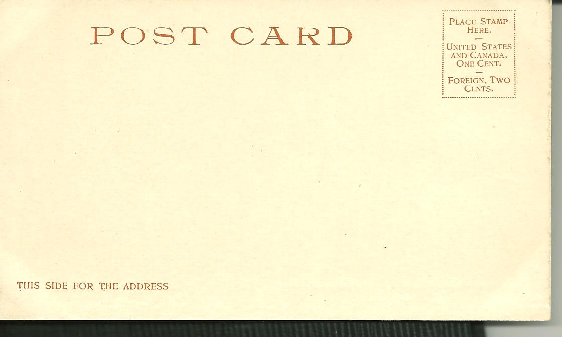
I know that it belongs to the group of postcards known as those from “the divided back” era. Beginning on March 1, 1907 postcards were able to be sent through the US Mail with an actual message on the same side as the address. Prior to that date, only the address was allowed on the “back” of the card. (There are some of these to come in the future in this blog.) People were not used to this so the postcard printers added the words: “THIS SPACE CAN BE USED FOR A WRITTEN MESSAGE USING A ONE-CENT STAMP”.

This postcard demonstrates exactly that: a message on the left and the address on the right. It was sent by someone named Henry from Denver, Colorado to Marie Reinecke of Los Angeles, California in 1913. It is postmarked on June 26th at 5:30 PM. The handwriting script is beautifully elegant, but I cannot make out enough to know what the message is.

I do not even know either who the printer or the publisher were. By looking at the scrollwork around the words Post Card, I would think that I can identify at least who the printer was. But, I do not have any postcards with similar scrollwork that give away any clues. I will continue my quest.


I do know about the front of the card. It is a picture of The Royal Gorge in Colorado. This canyon is also known as the Grand Canyon (sometimes canon with out the accent over the first n) of the Arkansas River. It is 10 miles long, 50 feet wide at the bottom and about 1,250 wide at the top.

On April 19, 1878 construction, and a turf war, began as the construction crew from the Denver and Rio Grande Railroad started to work on the grade for a rail line through the canyon. This began a lengthy legal battle between the D&RG and the Santa Fe – both wanting the right of way through the gorge. The Supreme Court of the US finally decided in favor of the D&RG on April 21, 1879. The first train went through the canyon on May 7, 1879.

Today, you can still ride the scenic rails through the canyon. This is the website that links you to quite the adventure. http://www.royalgorgeroute.com/ You can even pay for a ticket that allows you to be up in the cab with the engineer.

The next very many posts will be about my postcards with the theme: “The Royal Gorge”. There is a lot of history there and I hope to share some of it with you in the coming weeks.

Sunday, March 6, 2011

I am ready to steam ahead!

I have been working on my collection feverishly for a couple of years now... I purchased a book in which the words "don't forget to look at the back of the postcard" were included.  I decided to look at the backs of my postcards.  There, I discovered that one can learn about the age of the card, who the printer of the card was, and who the publisher was (they aren't always the same).  On line I found many details about the printers and publishers. 

It has been a while since I posted anything. 

Now, get ready to sit back, relax and read about the postcards in my collection.  You will discover fascinating details that will bore the normal person right to sleep.  These same details will excite the nerdiest nerds and keep us up all night on the edges of our seats.

I hope you enjoy the near future on this blog.